Introduction
Designing a great interface is not only about visual polish. The real challenge is helping users understand what to do next, reducing hesitation, and making each interaction feel predictable. User-centric UX does exactly that by grounding product decisions in real behavior instead of assumptions.
At TechGuys, we often see the same pattern when teams request a redesign: there are many feature ideas, but limited evidence about where users are actually getting stuck. The result is familiar: overloaded navigation, forms that ask too much too early, unclear feedback states, and major drop-offs on mobile. A structured UX approach fixes these problems before they become expensive.
In this article, we share how TechGuys designs user-centric interfaces in real client projects. You will find visual project examples, our UX process explained step by step, practical tooling categories, our user-testing approach, and a client testimonial from a UX-driven transformation. The goal is to give you a practical operating model you can apply with your own team.
Why user-centric UX is a growth lever (not a design luxury)
When an interface is confusing, the business impact appears quickly: lower conversion rates, more support requests, slower onboarding, and weaker trust in the product. Users do not abandon because they dislike a color palette. They abandon when they cannot confidently complete a task.
Across TechGuys mandates, a user-centric UX method consistently helps teams:
- increase mobile form completion;
- reduce support requests tied to navigation friction;
- improve onboarding retention;
- prioritize roadmap items using behavioral evidence;
- align design and engineering decisions around measurable outcomes.
This is why UX is not a final "layer" added after development. It is a cross-functional discipline that connects product strategy, interface behavior, and technical execution.
Visual examples from TechGuys projects
To make these ideas concrete, here are three examples from projects delivered by TechGuys. Each screenshot illustrates a specific UX decision that improved clarity, speed, or confidence.
1) Plania AI: guiding users through complex decisions
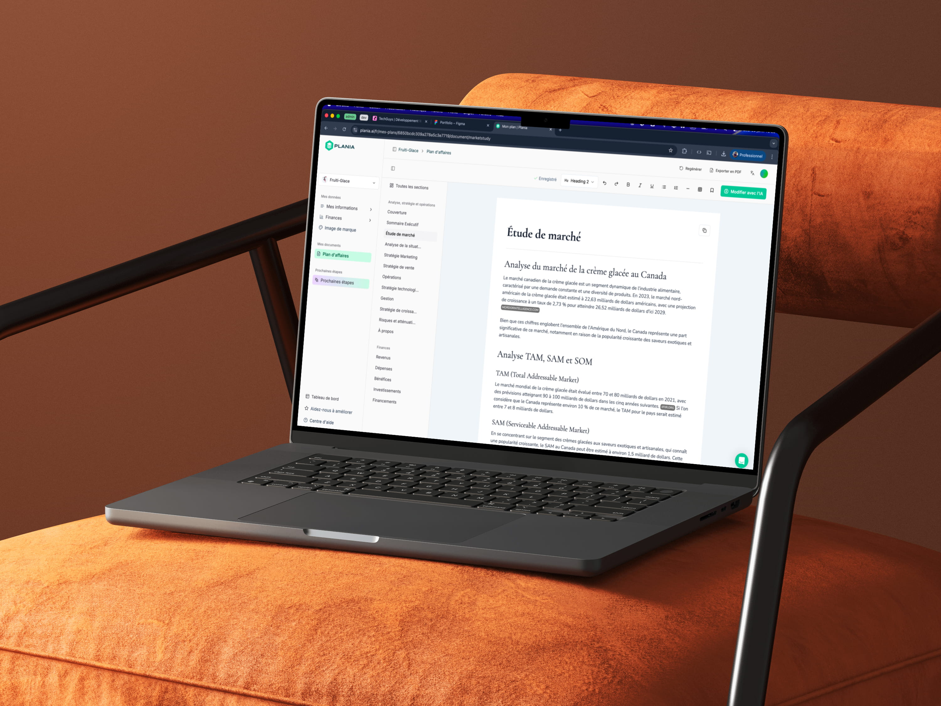
Plania AI includes advanced planning and projection workflows. The core UX risk was cognitive overload in the first session. We addressed this by building a guided flow with short sequential steps, one primary goal per screen, and persistent progress indicators.
The impact was immediate during moderated testing: users could describe where they were in the flow and what would happen next. That reduction in uncertainty led to higher completion of the onboarding journey.
2) Stronger Together: mobile UX for repeated actions
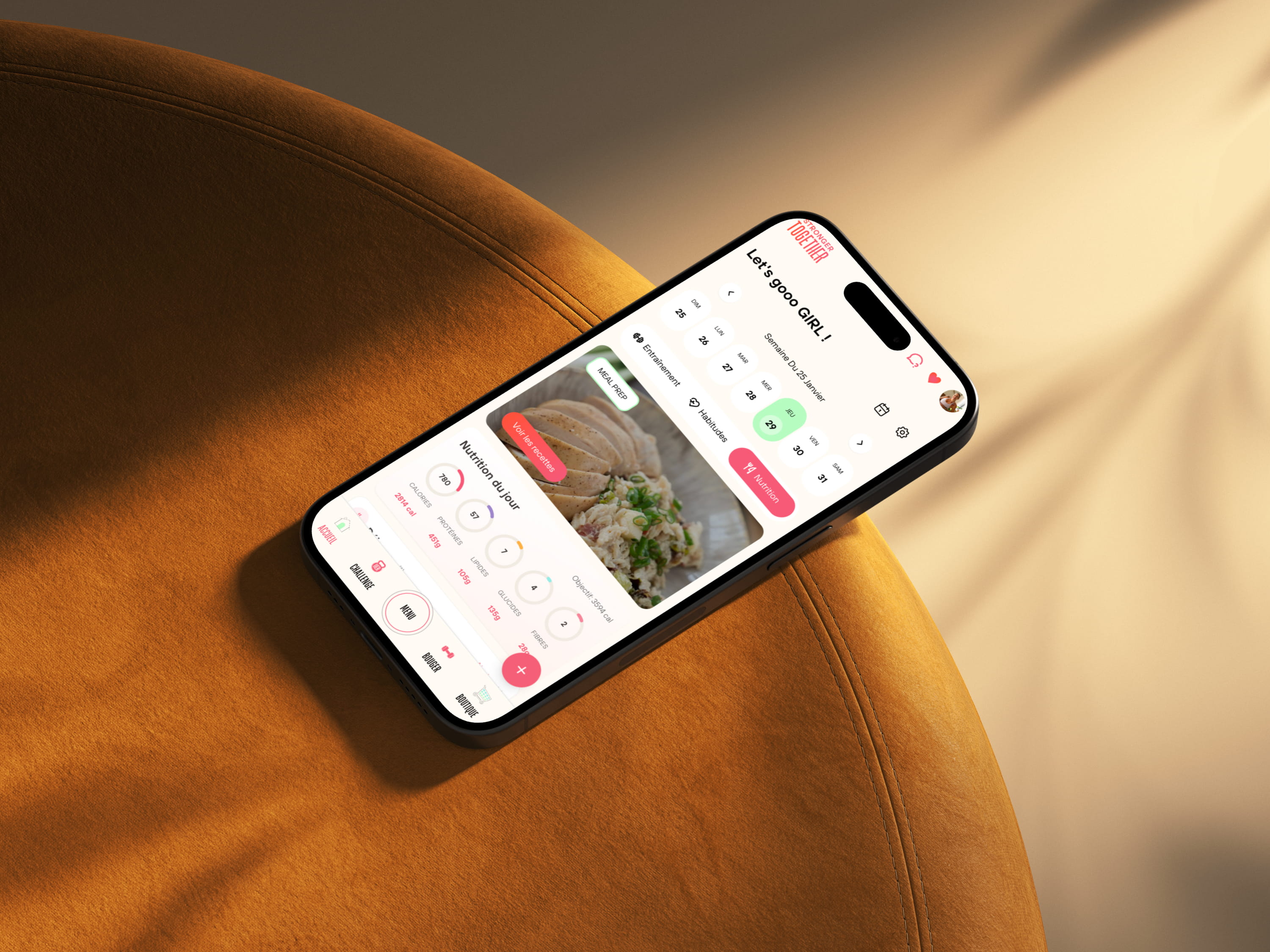
For Stronger Together, daily engagement was more important than one-time completion. We simplified the navigation structure around repeat actions (training, nutrition, journaling), used persistent shortcuts, and made state changes obvious after every interaction.
This helped users build habits without relearning the interface every day. The app felt faster and more dependable because key actions stayed consistent across screens.
3) Bibliotheque Laval: discoverability for diverse audiences
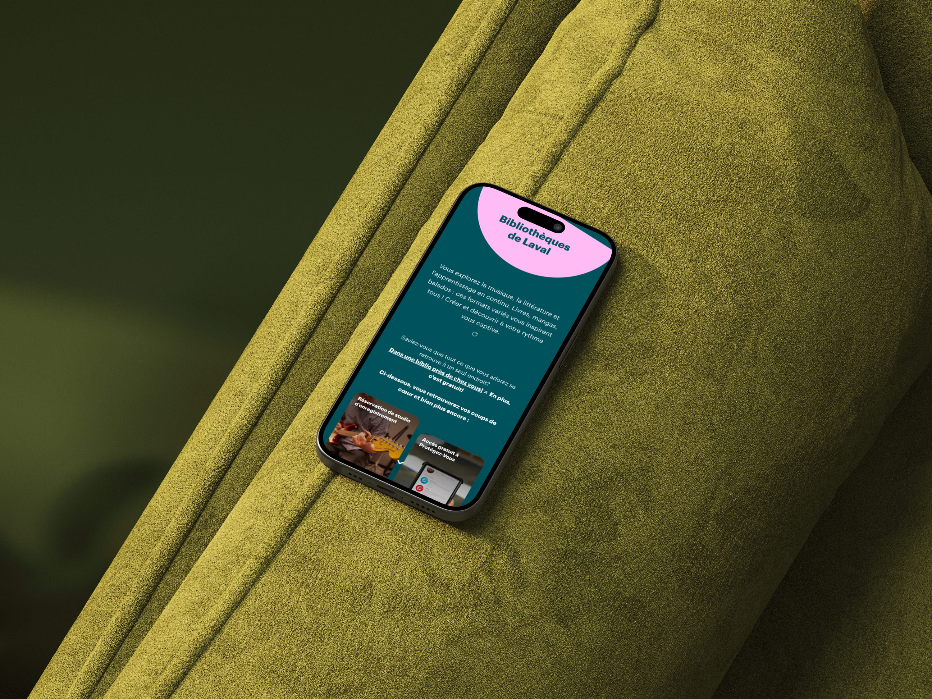
Bibliotheque Laval needed to support very different audiences, from occasional visitors to staff members. A generic layout would have increased confusion. We redesigned content hierarchy with clearly labeled thematic blocks, explicit filters, and simplified language.
The result was an interface that remained understandable even for users with low platform familiarity. Consistent labels and predictable interactions lowered navigation effort significantly.
The TechGuys UX process in 7 practical steps
Our process is iterative, but structured enough to keep decisions evidence-based from discovery to post-launch optimization.
Step 1: Business framing and UX KPI definition
Every project starts with alignment across product, marketing, operations, and (when possible) support teams. We define critical user journeys, technical constraints, and UX KPIs such as task completion, time-to-success, error rate, and user confidence.
Step 2: User research and context analysis
We combine interviews, behavior analytics, and existing feedback channels to identify actionable friction points. The objective is not to create heavy documentation. The objective is to pinpoint decisions that will move user outcomes.
Step 3: Journey mapping and information architecture
Before visual design, we clarify structure: what information appears, in which order, and under what navigation logic. This avoids the common mistake of making a confusing architecture look "nice" without improving usability.
Step 4: Wireframes and interactive prototypes
We start with low-fidelity wireframes for critical screens, then move to clickable prototypes for realistic flows. This allows rapid validation of comprehension, hierarchy, and interaction design before implementation.
Step 5: Moderated and unmoderated user testing
Moderated sessions reveal why users struggle. Unmoderated task tests provide scale and pattern confirmation. Using both methods gives us depth and breadth, which leads to more reliable prioritization.
Step 6: Design-to-development handoff with behavior specs
UX quality often breaks at handoff. We document state behavior, error handling, priority rules, edge cases, and expected transitions so engineering teams can implement interactions consistently.
Step 7: Post-release measurement and iteration loop
After launch, we track KPI movement on the journeys defined in Step 1. Findings feed the next iteration cycle. User-centric UX is never a one-off phase; it is a compounding operating system.
Practical UX tooling categories for delivery teams
Tools do not replace method, but a coherent toolkit improves team alignment and decision speed. The examples below are common categories and representative options used in UX delivery contexts.
For trusted implementation references, teams often align with MDN's accessibility guidance, Google's Core Web Vitals documentation, and Nielsen Norman Group usability research.
Discovery and team alignment
- Documentation workspaces (such as Notion or Confluence) for assumptions, goals, research summaries, and decision logs.
- Collaborative whiteboards (such as FigJam or Miro) for workshop facilitation, journey mapping, and problem clustering.
- Async walkthrough tools (such as Loom) for test debrief recordings and stakeholder alignment.
Design and prototyping
- Interface design platforms (such as Figma) for wireframes, high-fidelity design, and interactive prototypes.
- Shared component libraries to maintain consistency at scale.
- Design tokens for stable typography, spacing, and color systems.
User testing and validation
- Unmoderated testing platforms (such as Maze) for task-based validation at scale.
- Video conferencing tools (such as Zoom or Google Meet) for moderated interviews and live usability tests.
- Short post-task surveys to capture perceived clarity and confidence.
Behavioral measurement and iteration
- Behavior analytics tools (such as Microsoft Clarity or Hotjar) for qualitative behavior patterns.
- Web analytics suites (such as GA4) for funnel analysis and drop-off diagnostics.
- Journey-level KPI dashboards to connect UX issues to business outcomes.
How to structure user testing for decision quality
A useful test is not a generic "feedback session." It must answer a clear product question.
A practical operational framework looks like this:
- Define the hypothesis (for example: "the new onboarding reduces time-to-understand").
- Design realistic tasks that mirror actual user goals.
- Recruit representative participants for priority segments.
- Capture mixed evidence: completion rate, time, errors, and qualitative comments.
- Translate findings into decisions with owners and implementation priority.
This discipline prevents two expensive mistakes: testing too late, and confusing aesthetic preference with proven usability improvement.
Client testimonial: HotellerieJobs
In a recruiting platform project, HotellerieJobs faced a gap between qualified traffic and candidate conversion. We redesigned key UX elements: search flow clarity, filter hierarchy, candidate/employer action labels, and feedback states in the application journey.
"We had user interest, but the journey felt overloaded and unclear. TechGuys helped us simplify the experience screen by screen. User feedback improved quickly, and our internal team now has a practical method for evolving the platform with confidence."
- Product Lead, HotellerieJobs
Beyond short-term conversion gains, the long-term win was a repeatable decision model: explicit hypotheses, regular testing cycles, and impact-based backlog prioritization.
Internal resources to continue your UX transformation
If you want to connect UX strategy with full product delivery, these pages are useful next steps:
- Core service: web application development
- Transaction journeys: website and ecommerce development
- Smart experience layers: AI-powered applications
- Complementary reading: modern web development best practices
A practical 30-60-90 UX roadmap
If your team wants quick progress without waiting for a full rebuild, this roadmap works well:
- Days 0 to 30: audit critical journeys, define UX KPIs, run 5-8 user interviews.
- Days 30 to 60: prototype high-impact screens, run moderated/unmoderated tests, prioritize fixes.
- Days 60 to 90: ship in controlled batches, instrument journeys, evaluate impact, iterate.
This structure creates visible momentum while preserving product stability.
Conclusion
Designing user-centric interfaces requires more than tasteful visuals. It requires a repeatable method, disciplined user testing, and strong execution between design and development. The TechGuys examples in this article show that UX results come from system-level consistency, not isolated design tweaks.
If your product is losing users through confusion, drop-offs, or inconsistent mobile behavior, start with journey clarity, test earlier, and measure continuously. Over time, these habits turn UX quality into a durable competitive advantage.